WEBSITE/BOOKING FORM

Haig's

Haig's Drains is a local, friendly and approachable drainage company with the same innovative services most people usually associate with larger, less personable businesses.

PROJECT TIMELINE

3 weeks

THE TEAM

1 UX Designer (myself!)
1 Developers

MY ROLE

UX/UI designer for end-to-end product design

MAIN GOAL

Improve engagement with the booking function of the website

01.
THE PROBLEM

Haig's is a small, independent company in Yorkshire who provide a range of drainage services locally.

As they have limited resource, they often find managing bookings and scheduling jobs difficult and very time consuming.

As most potential customers search online for drainage services they wanted to increase conversions on their website and also integrate it with a CRM to help manage and priorotise bookings and clients.

02.
MY ROLE

As the sole designer, I had the opportunity to spearhead the UX design of this website:
Design:
• UI Design
• Visual Design
• Wireframes
• Mockups
• Interactive Prototype
• Design Iterations
User Research:
• Stakeholder interviews
• Competitor research

03.
UNDERSTANDING 
USERS

To understand more about the existing user experience, we conducted user research with 5 participants. This led to the development of two personas.
User Personas
Based on conversations with current users and potential users, I created personas for typical users that are looking to visit the Haig's website. These will guide design decisions and the team's priorities throughout the project.
Remote Usability Testing
By reaching out to 5 existing users and asking them to contact Haig's, I was able to validate some of our persona assumptions and spot users’ pain points.
Important User Insights:
1. Unable to use a form to book Haig's services

04.
DEFINING THE
PROBLEM

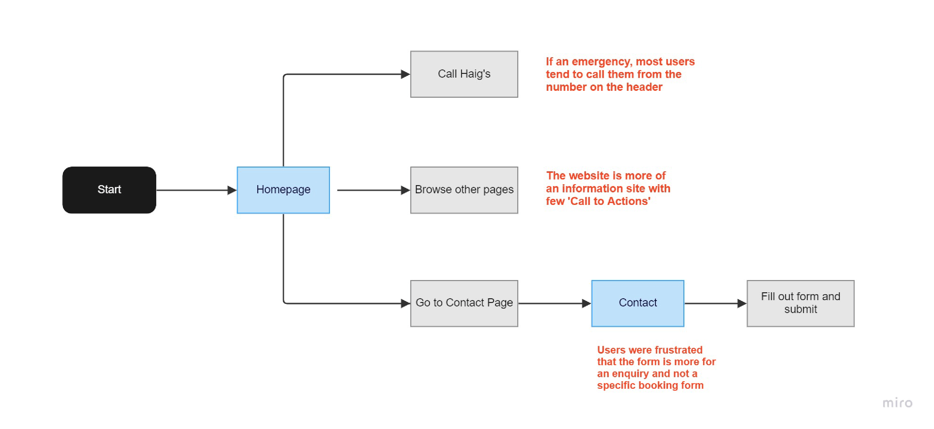
Analysing Existing User Journey
I analysed the existing user flow of a user trying to contact Haig'search to understand where users issues could be highlighted (highlighted in red text).
Identifying Pain Points
After usability testing, I wrote down each user’s pain points onto a Post-It note. Then I used affinity mapping to group the pain points into similar categories on a wall.
Prioritizing Pain Points
1. 80% of users pick up the phone. This is a painpoint from a resource perspective at Haig's as they are juggling lots of admin tasks at any one time. 
2. The website has few 'Call to Actions' and is more of an information website with lots of text.
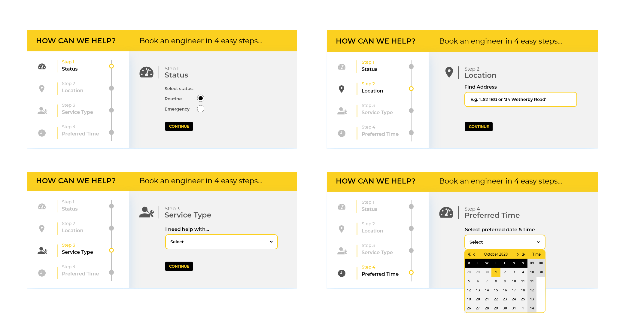
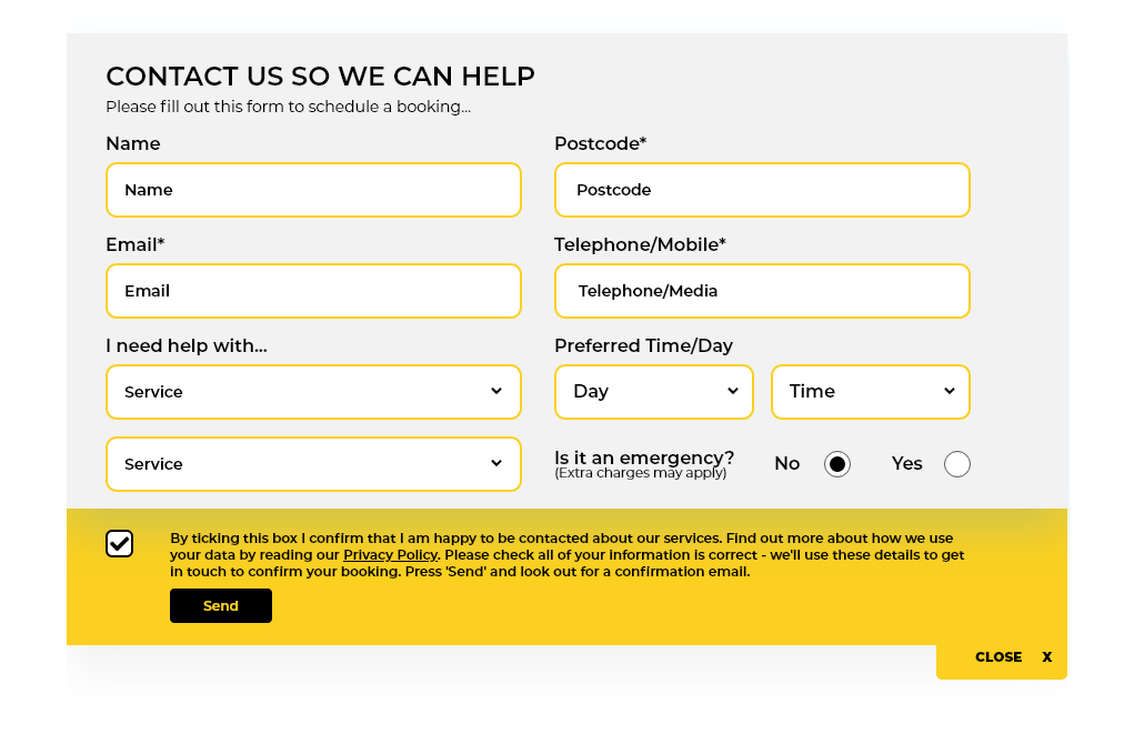
3. The only form on the website was on the contact page. This was a basic enquiry form with no fields to be too specific about the service required.
Understanding the problem to be solved...
Taking user needs, user pain points, and business needs into account, we came up with these questions:
1. How might we provide a journey that will encourage users to use a form and reduce the number of calls received?
2. How might we ensure that it is easy to navigate to the booking form?
3. How might we improve the website 'look & feel' of the website so that it builds trust and credibility?

05.
IDEATION

Website Wireframes
I created some wireframes using Figma to show the client and development team rough ideas for the app functionality, layout, and UI components. 

The wireframes made it easier for developers to communicate feasibility issues and offer feedback early on.
I used Figma to create a high-fidelity mockup of the form on the contact page. 
By providing a four step process and then provide contact details keeps entering information simple and easy.
This would then be integrated into a funnel in their CRM and allow them to keep the information centrally.

06.
PROTOTYPING

Mockups
I used Figma to create high-fidelity mockups of my proposed solutions.
Website Mockups
I used Figma to create a high-fidelity website mockups. 
I ensured there were more CTAs (Call to Actions) on each page, the amount of text was reduced and there were more visual signposts and links to other pages.   
Booking Form Mockup
I used Figma to create a high-fidelity mockup of the form on the contact page. 
By providing a four step process and then provide contact details keeps entering information simple and easy.
This would then be integrated into a funnel in their CRM and allow them to keep the information centrally.
Contact Form Mockup
I used Figma to create a high-fidelity mockup of the form on the contact page. The aim here was to capture all required information from the user and ensure all would be required following this would be a follow up to confirm date/time and costs..
THE SOLUTION
A colourful, more visual user experience  with more CTAs
1. Making it more visual
I used relevant imagery to create a more engaging website and also used the brand colours to give credibility and give a corporate yet friendly feel. Whilst they are a small company, in order to build trust they must have a more established look.
2. Better conversion opportunities
Creating two different forms (one on every page and the other on the contact page) that have more relevant fields is a big improvement on what the existing website has.

07.
VALIDATION

Testing the Prototype
I tested the interactive prototype with 5 new users to validate whether the problem has been solved. 
After conducting validation tests and iterating designs:
• All users were able to navigate through the mobile website more easily
• All users found the CTA buttons and key information
• All users felt that they would be more likely to contact Haig's

08.
KEY TAKEAWAYS

Lessons Learned
It is often challenging speaking to stakeholders. In this case it took time for them to feel happy to move to a booking system to fre up time by not spending more time on the phone. Once they could see that using a booking form with an integrated CRM they were very happy in the end.
The Results...
More Bookings
allowing the admin team more time to do 
other things and spend less time on the phone
Increased Page Views
users viewed more pages and spent longer on each page
What’s Next?
In the next update, I have made a recommendation to sign up and integrate the website with Trust Pilot for real time reviews.

This will add even more trust and credibility.

Location

Harrogate, North Yorkshire
apartmentenvelopeusersphonepushpinsmileclock linkedin facebook pinterest youtube rss twitter instagram facebook-blank rss-blank linkedin-blank pinterest youtube twitter instagram