MOBILE WEBSITE

BeCRM

A bespoke CRM & marketing platform for small to enterprise businesses. It boasts a host of features from contacts, calendars through to email marketing and reporting. With the redesign it also required the implementation of new features.

PROJECT TIMELINE

4 months

THE TEAM

1 UX Designer (myself!)
1 Product Manager
1 Product Owner
3 Software Developers

MY ROLE

Lead UX/UI designer for end-to-end product design

MAIN GOAL

New user interface and a better user experience to enable to access new features

01.
THE PROBLEM

BeCRM is a platform that is over 15 years old. As new features have been added overtime little consideration was given to user experience in mind.
The front-end has had minimal interface changes so its dated appearance (depsite the technology that sits behind it). 

This combined with the emergence of newer SASS products to the market has meant potential users overlook the platform and existing clients were looking at alternatives.

The main USP behind BeCRM is that support is only a phone call or email away and they provide 121 onboarding, bespoke implementation and technical support. 

This gives the user peace of mind that they can resolve any issues quickly and by seaking to someone as opposed to using a ticketing system and emails.

With the platform more new features needed to be included that would help raise the bar and compete on a more commercial level.
Please note: To comply with my non-disclosure agreement, I have omitted confidential information in this case study. All information in this case study is my own and does not necessarily reflect the views of the company I worked for. I have replaced the original company and product names with the alias, “BeCRM”.

02.
MY ROLE

As the sole designer, I had the opportunity to spearhead the UX design of this website:
Design:
• UI Design
• Visual Design
• Wireframes
• Mockups
• Interactive Prototype
• Design Iterations
User Research:
• Competitor analysis
• User interviews
• Stakeholder interviews
• User testing
• Personas
• Affinity maps
• Usability testing

03.
THE PROCESS

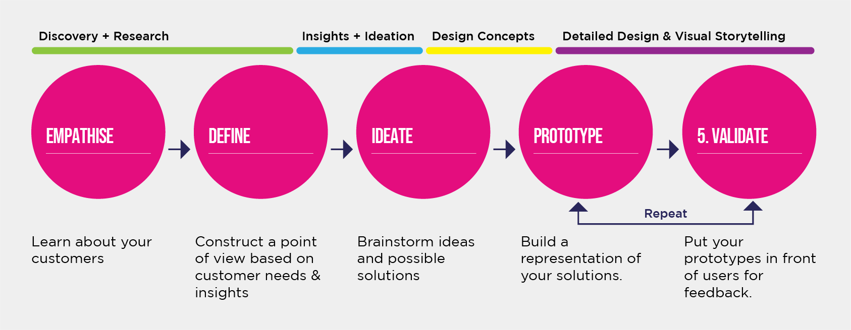
I follow IDEO’s human-centered design and lean UX design thinking process to make sure that my design decisions are supported by user research and feedback.

04.
UNDERSTANDING 
USERS

As the platform had over 600 clients it was easy to gather information and get useful insights.

We firstly conducted user research with 20 participants in a workshop. This involved myself running the session and trying to establish their feelings towards the platform and what the main challenges are, as well as the good points!
User Personas
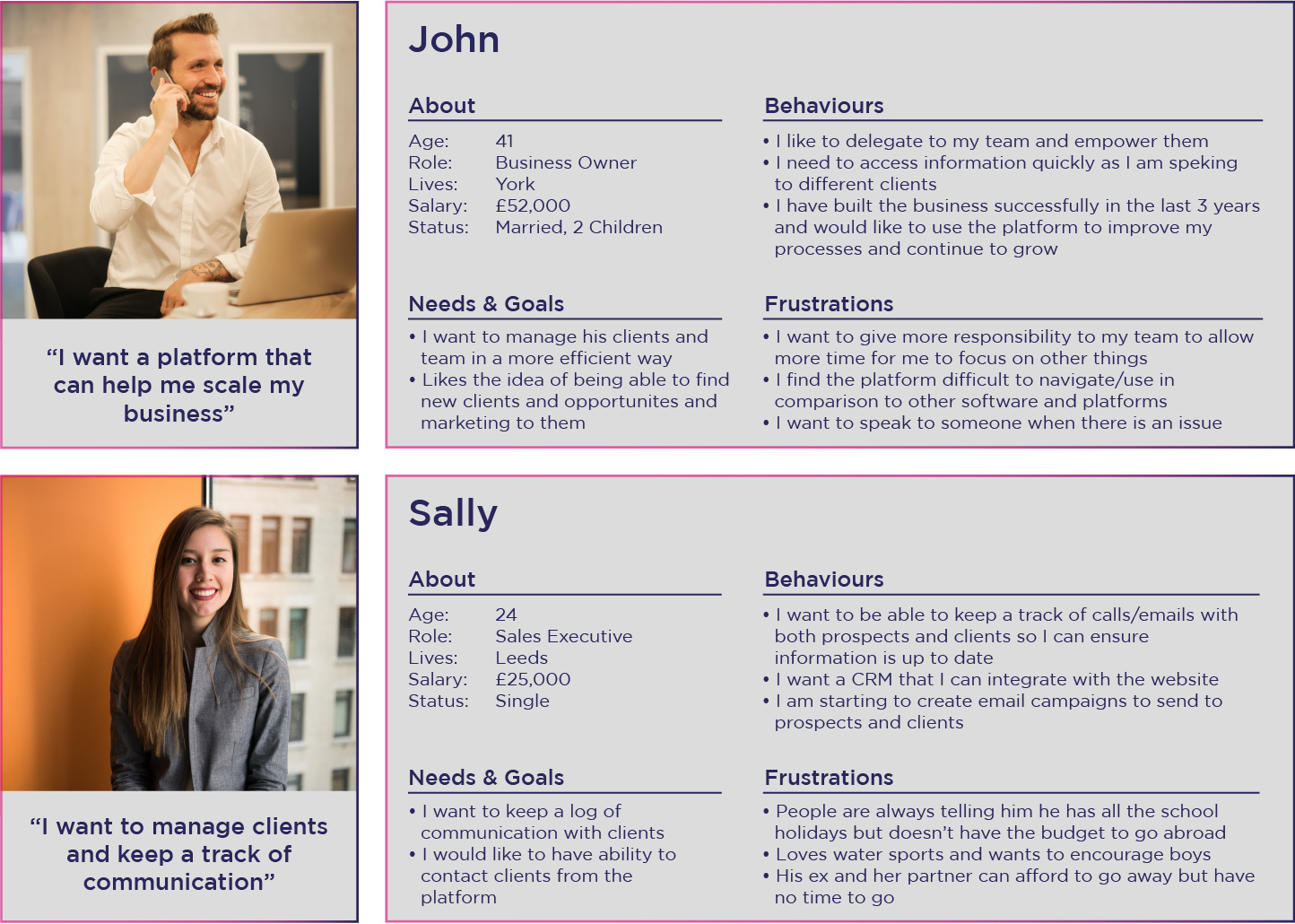
Based on conversations with current users and potential users, I created personas for a typical BeCRM user to guide design decisions and the team's priorities throughout the project.
Remote Usability Testing
By reaching out to 10 existing users and asking them to complete a series of tasks using BeCRM, I was able to validate some of our persona assumptions and spot users’ pain points.
Important User Insights:
1. I want to manage relations with my client and rpospects
2. I need to be able to add all details including tasks, contact, projects and opportunities
3. I want all of the data to be secure, but easily accessible and organised
Competitive analysis
Here is a competitive map to better understand where BeCRM stands in the current CRM market. 
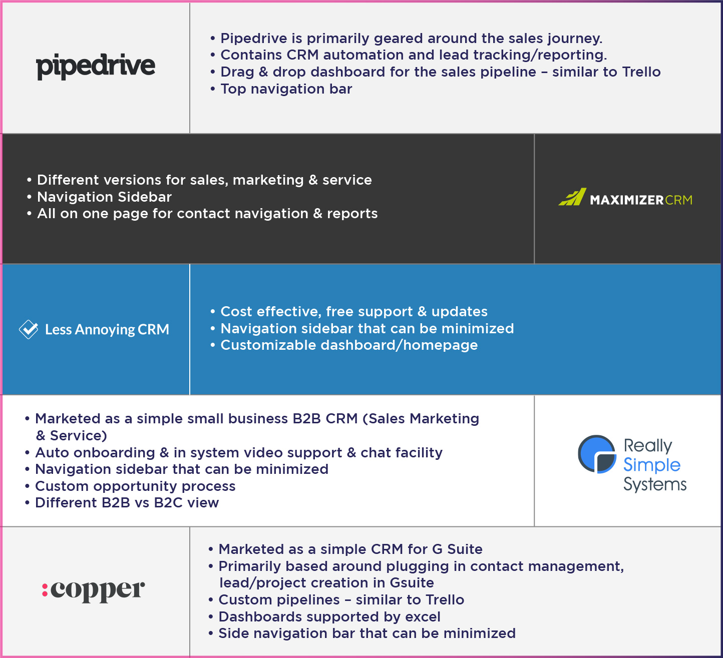
Each CRM had some good functionality and were user friendly. However, it was clear that with the features of BeCRM that with a more intuitive navigation and interface that it would compete well against it's competitors.

All CRMs were optimised for use on desktops but some had mobile apps with stripped down features as well.
05.
DEFINING THE
PROBLEM

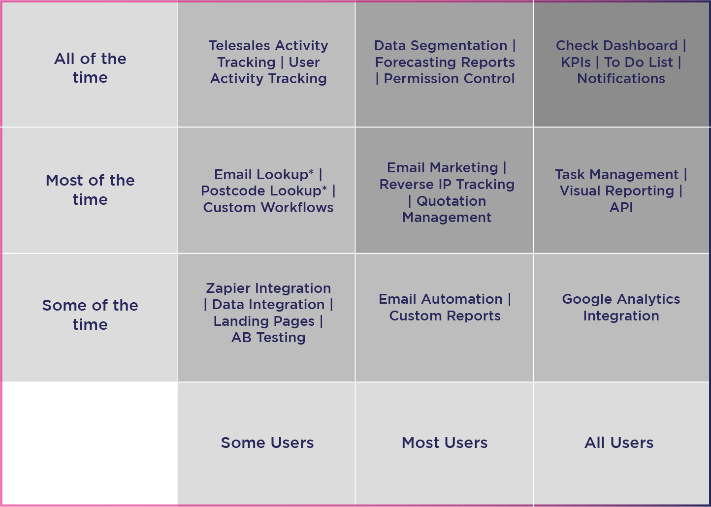
Features prioritisation
Due to the size of the project it was crucial to work through a list of features, solutions and improvements and define a plan and sequence.

Factors for the priority list included availabe resources, any technical limit,  benefit to the user and frequency of usage. This ensured the project did not have any bottle necks and the development process ran more smoothly.
Features marked with a * are new features and many users were not aware that they were available to use on the platform.

In addition, there is also an integration with Red Flag Alert, which captures and enriches data on every UK business, giving our clients the insights to deliver best-in-class sales, credit risk and compliance.

This service allows users to search, review and purchase data from the platform (for an extra cost).
Identifying Pain Points
After usability testing, I wrote down each user’s pain points onto a Post-It note. Then I used affinity mapping to group the pain points into similar categories on a wall.
Prioritizing Pain Points
1. The navigation is confusing and I only use the basic functions...
2. It has great features but it is hard to use and time consuming
3. The interface is very dated and not very intuitive compared to other CRMs
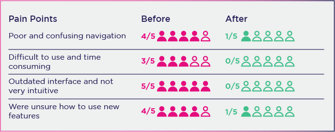
I redefined the pain points important to business and users:

1.

Poor and confusing navigation

2.

Difficult to use and time consuming

3.

Outdated interface and not very intuitive
Understanding the problem to be solved...
Taking user needs, user pain points, and business needs into account, we came up with these questions:
1. How might we make the platform more user friendly so they can benefit from the different features??
2. How might we create a user journey to incoporate new features seamlessly?
3. How might we improve the overall look and interface to make it more intuitive?
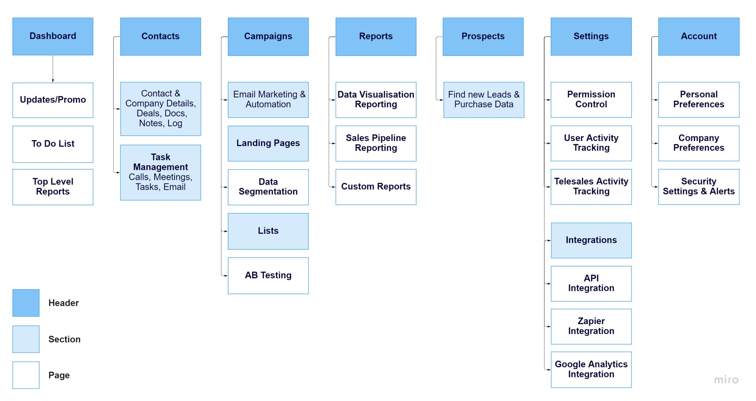
Information Architecture
As the project had a lot that required designing, I decided to break it down into different sections.
1. Dashboard 
Updates/Promos | To Do List Overview | Customisable Graphs/Charts/Reports
2. Contacts
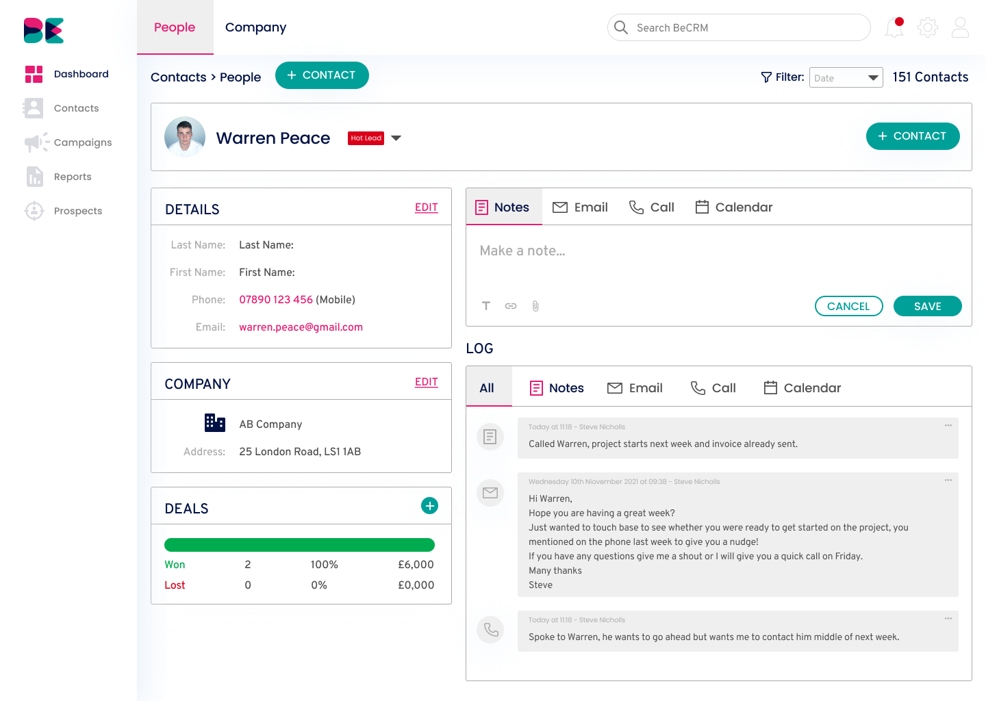
People Details | Company Details | To Do List | Calendar | Log
3. Campaigns
Email marketing | Email Automation | Landing Pages | Data Segmentation | Lists | AB Testing
4. Reports
Data Visualisation | Sales Pipeline Reporting | Custom Reporting | Custom Workflows
5. Prospects
Search & Buy Prospects
6. Settings
Permission Control | User Activity Tracking | Telesales Activity Tracking | Integrations
7. Account
Personal Preferences | Company Preferences | Security Settings & Alerts

06.
IDEATION

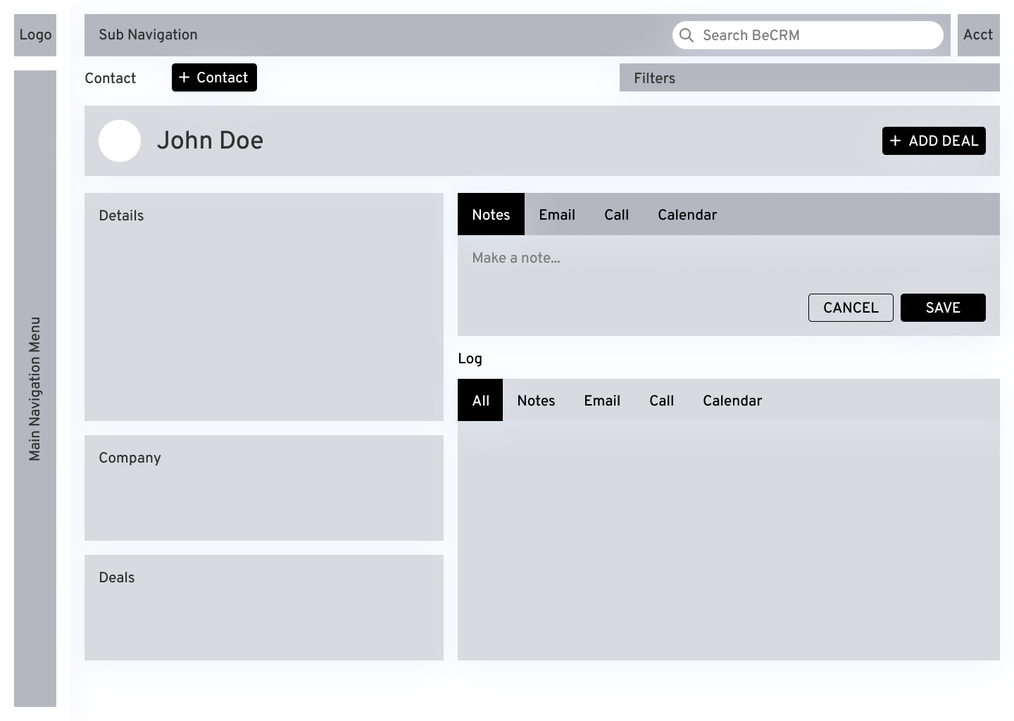
Wireframes
I created some quick wireframes using Figma to show the product manager and development team rough ideas for the app functionality, layout, and UI components. 

The wireframes are critical to communicate any potential issues with the developers offer feedback early on.

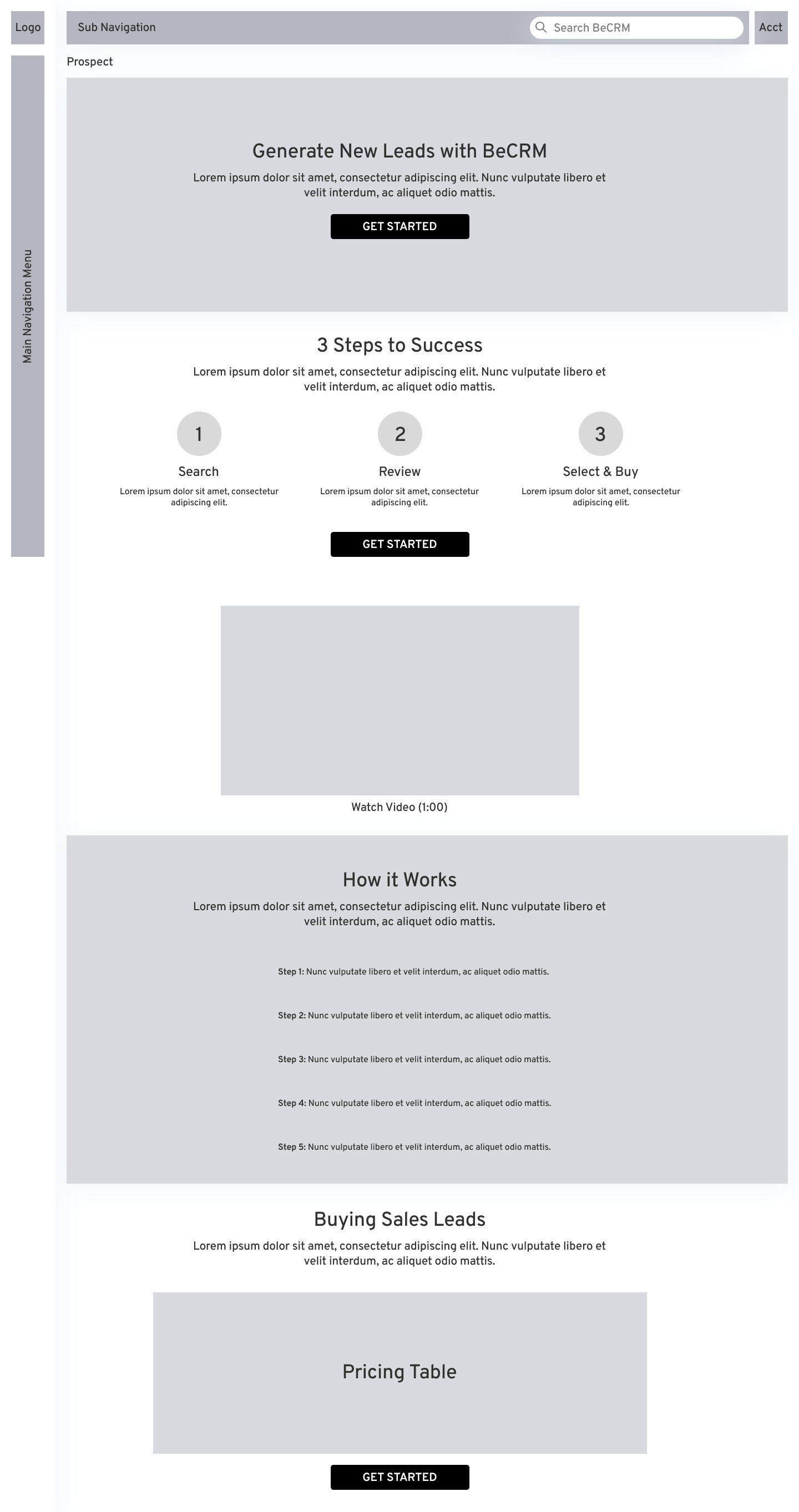
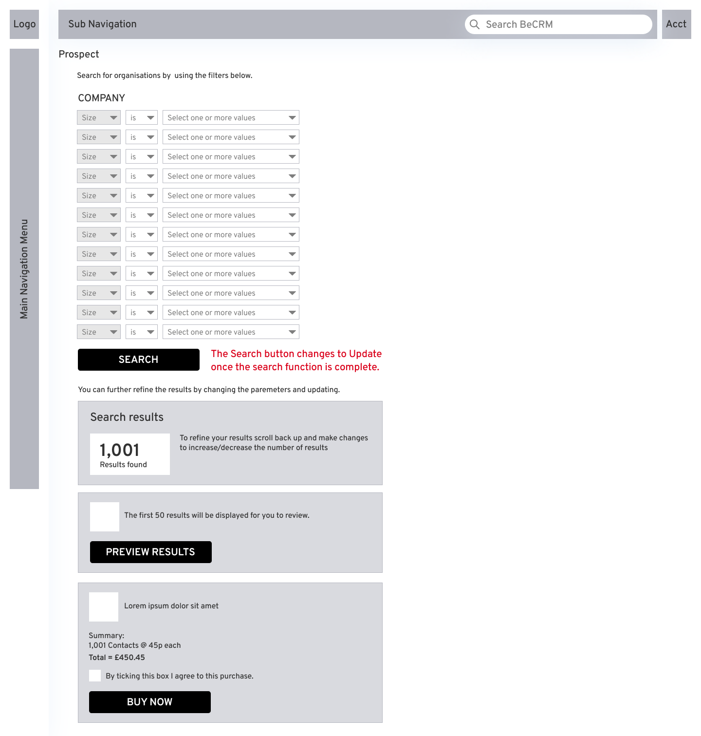
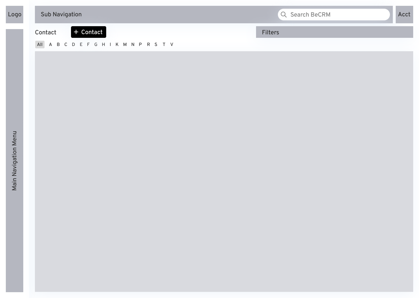
Rather than include every single page, I have included the Dashboard, Prospect section (this was completely designed from scratch as the featurs were new to launch) and the CRM section.
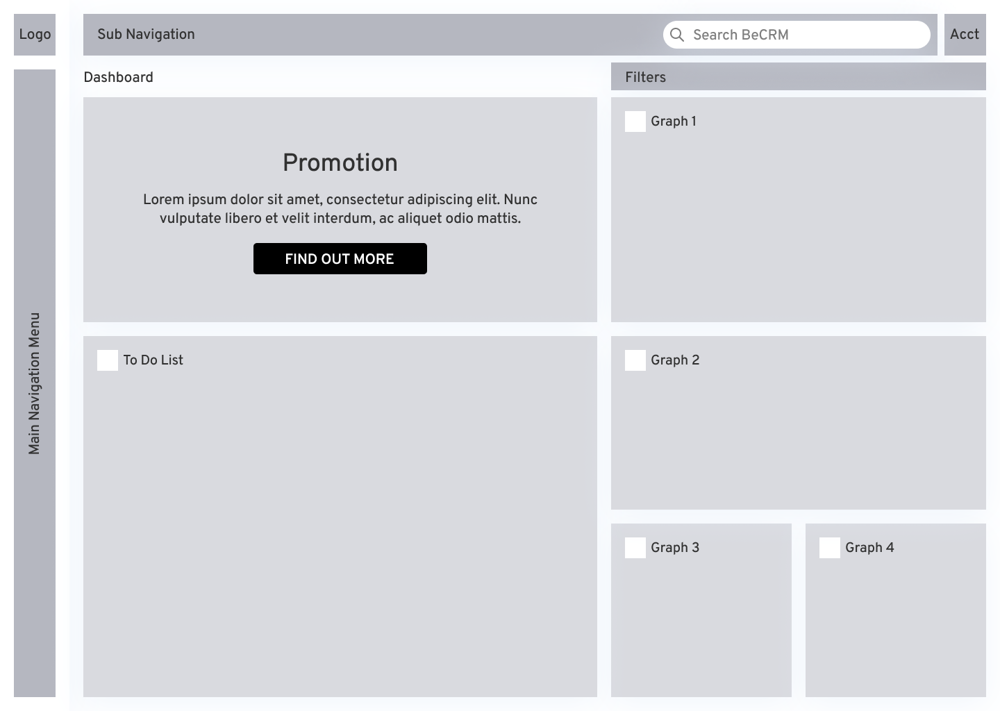
Dashboard
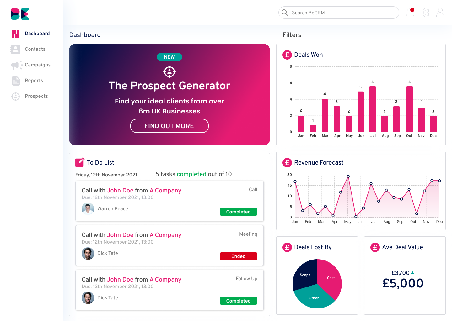
This page would be the landing page when first logging in to give an overview of the business and also provide a 'To do List' that were created in the CRM.

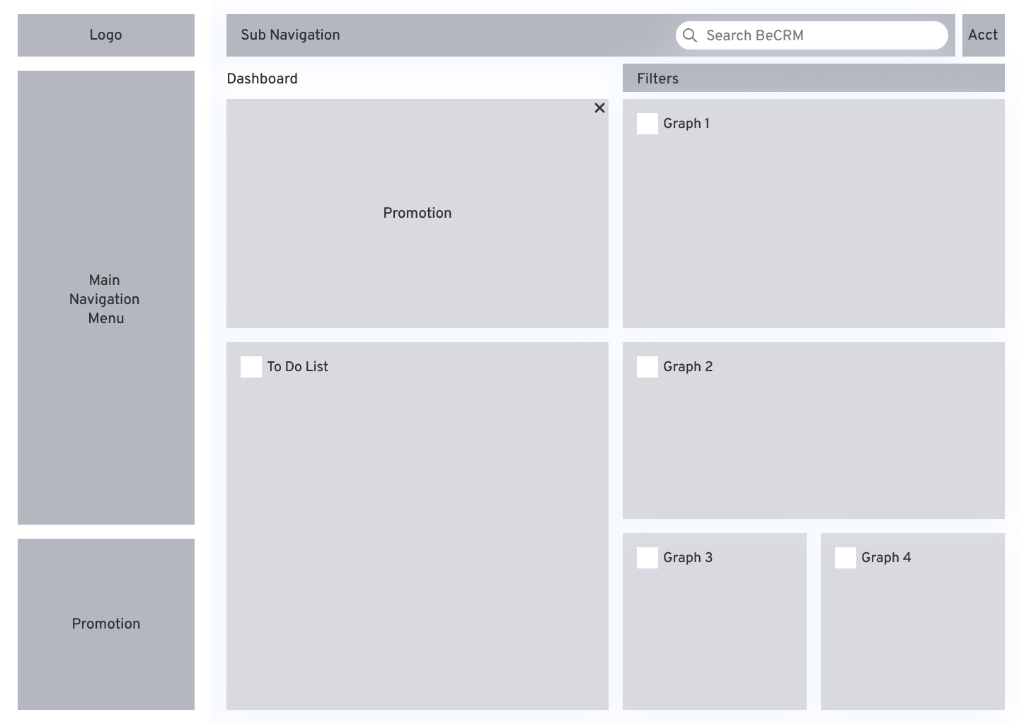
I created this wireframe with a compact sidebar navigation menu, optimising the content. The intention with the promotion block was to have the ability to showcase features that the user was perhaps unaware of or have never used.
This wireframe was identical but with the wider side navigation menu. For the remaining wireframes I used the compact version as when discussing it with the stakehlders and developers we agreed that using icons would be enoughgor users to navigate once they were familiar with them.
Prospect
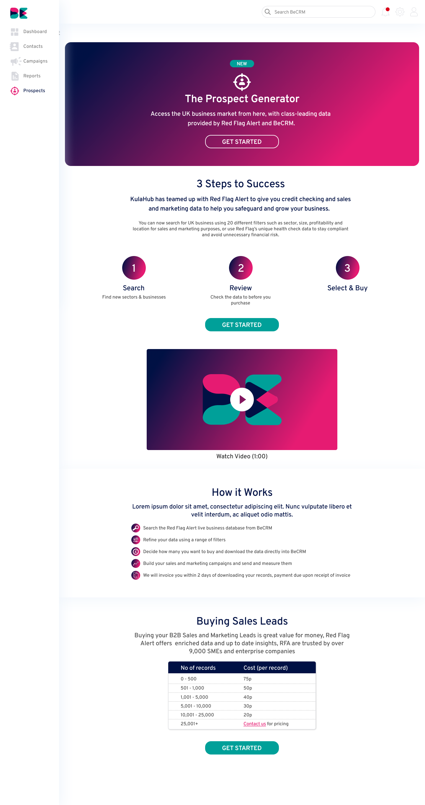
As this is a new feature I felt it was important to provide information and explain the process. Buttons were added throughout the page to allow users to click on them incase they have already used the feature.
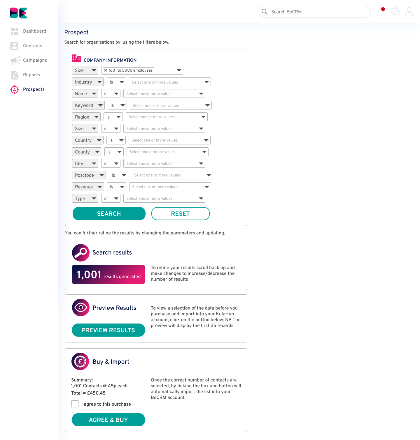
This page is where the user will add different parameters to get a set of results. The summary is displayed below and can be updated by going back to change the filters and clicking the update button.
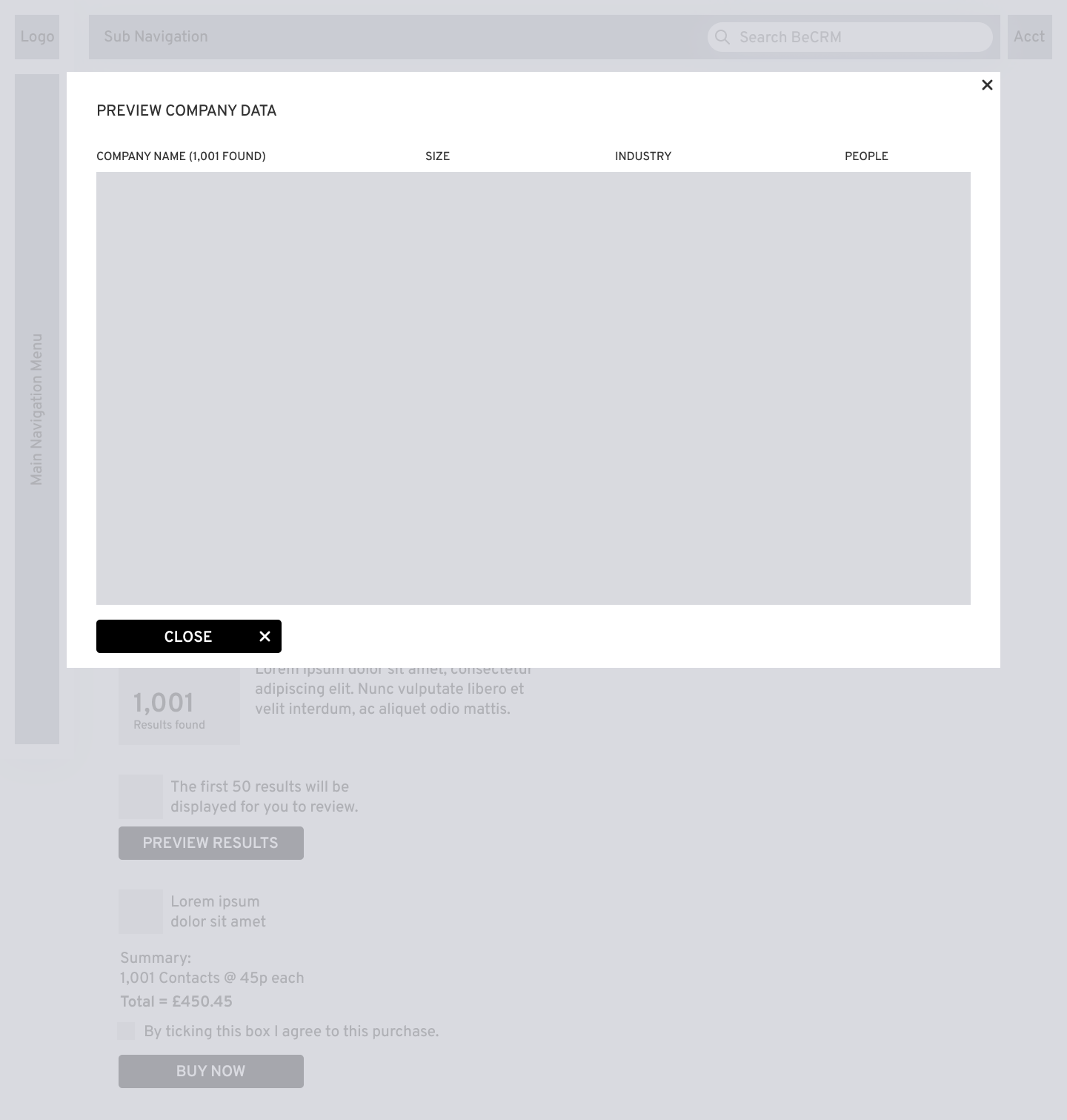
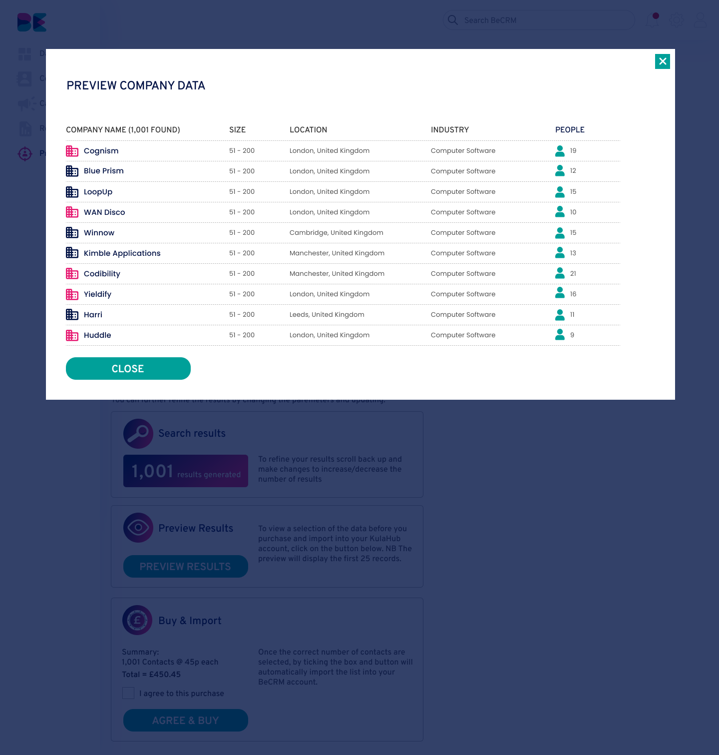
When previewng the results they pop-up in a modal. This can then be previewed and closed to take them back to the same page where they can either filter the further or purchase the data.
CRM
API | Zapier Integration | Permission Control | User Activity Tracking | Telesales Activity Tracking

07.
VISUAL DESIGN
& BRANDING

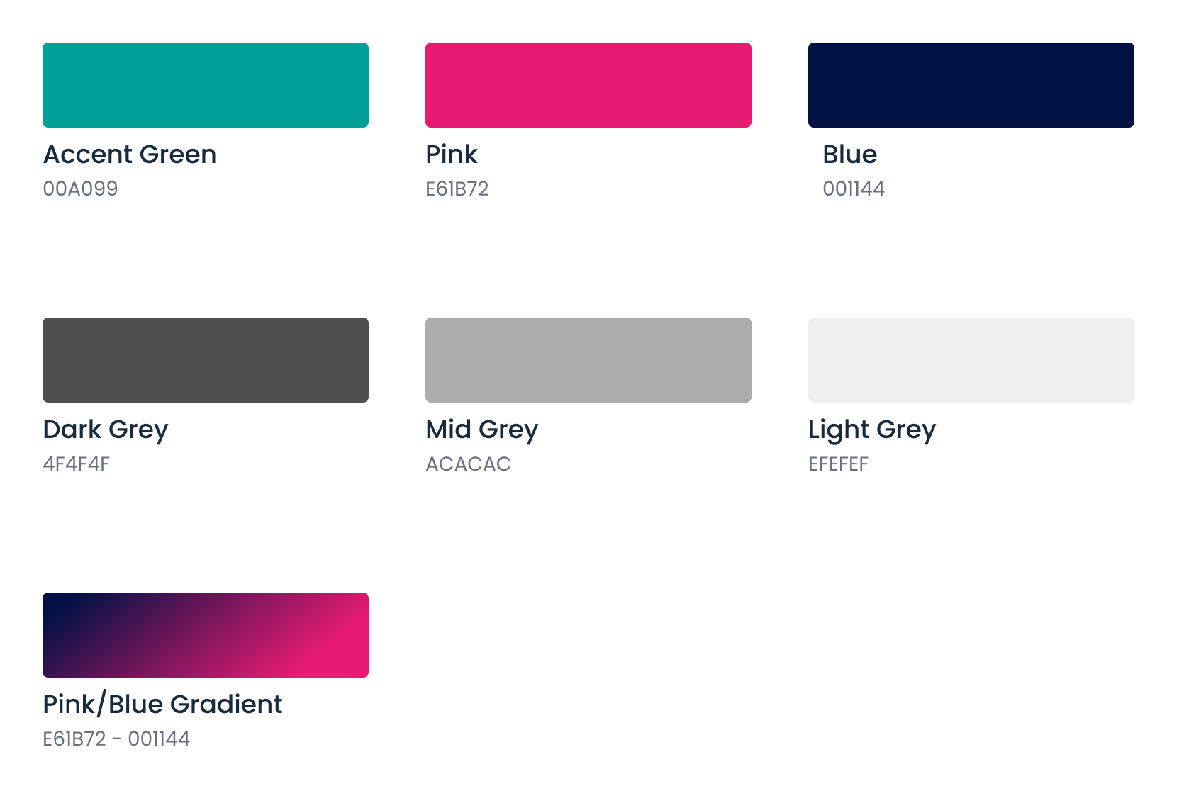
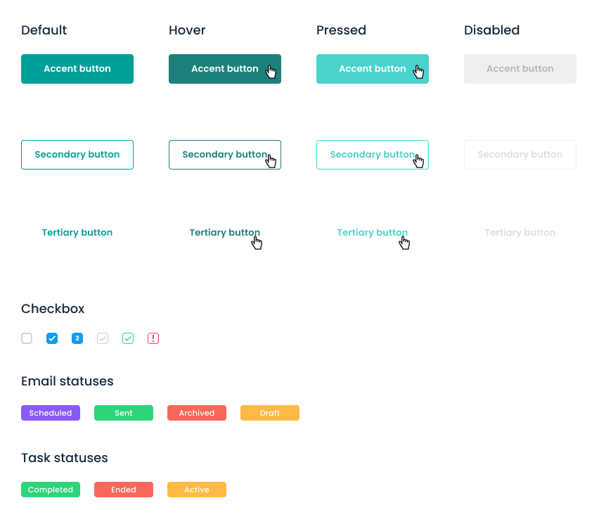
Style Guide
BeCRM’s brand is professsional and friendly. These brand values helped inspire the colour palette, and typography. I created the style guide using Figma.
Typography
Buttons
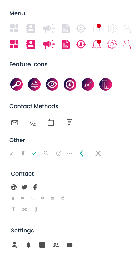
Icons
New icons were created to improve the user experience and to give the website a cleaner and simpler look. 

07.
PROTOTYPING

Mockups
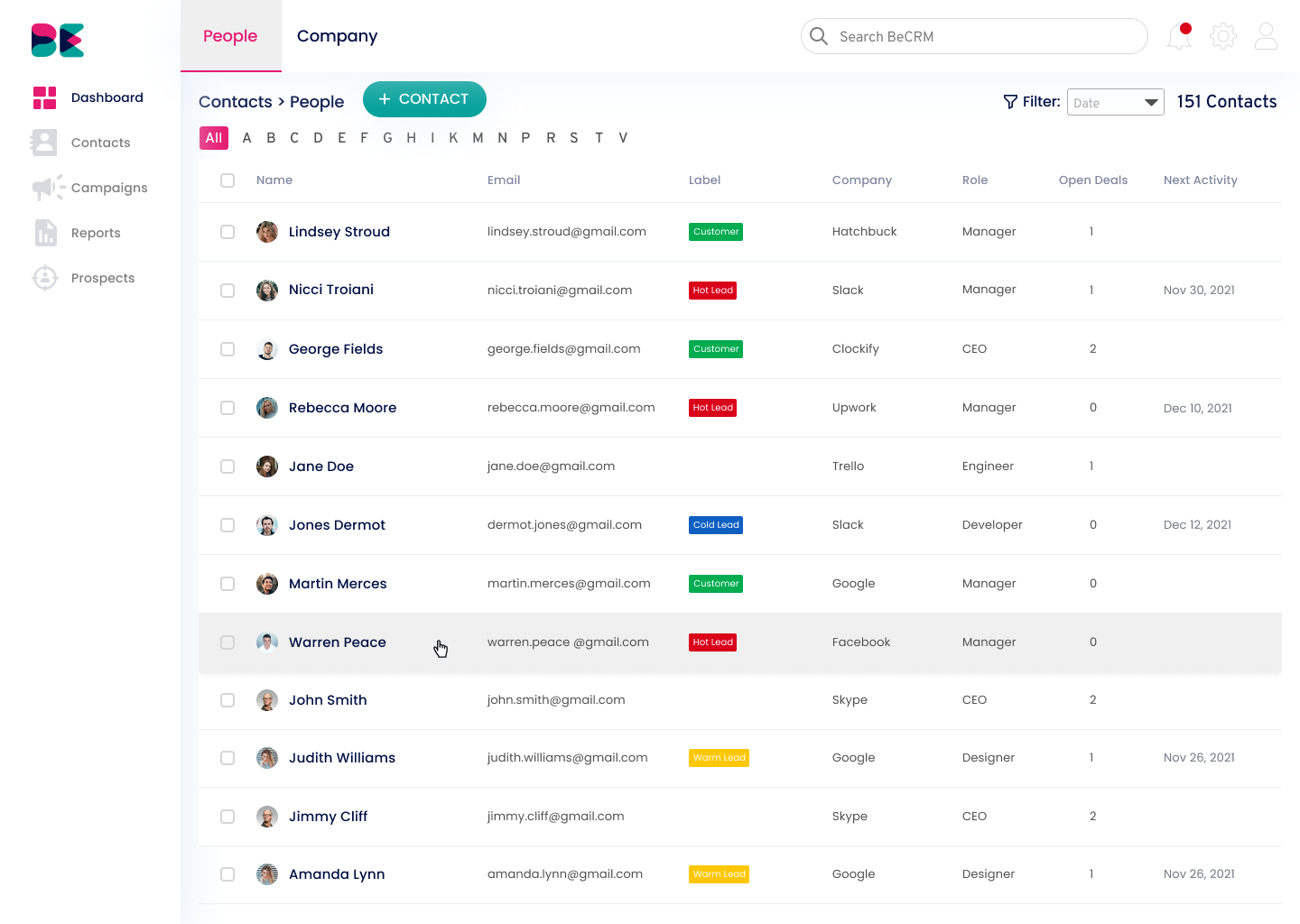
I used Figma to create high-fidelity mockups of my proposed solutions.
Dashboard
Prospect
CRM
THE SOLUTION
A clean, simple to navigate design with improved user experience
1. A more user friendly platform
With changes to the overall architecture it is now easier to access the different features and less time consuming to navigate. 
2. A better user journey
New features are much more visible and include a user journey with explanations and more of a  process to give a better understanding of what they are and how they can be used.
3. A cleaner and simpler user interface
It was important to update the interface as it looked a little outdated. By changing the layout of the pages it is more intuitive and much easier to use nd navigate, an essential as it is used every day.

09.
VALIDATION

Testing the Prototype
I tested the interactive prototype with 10 new users to validate whether the changes had improved the overall experience. 
Validating results:
After conducting validation tests and iterating designs:
• Users were able to navigate around the platform with ease
• The new design saved users time and was much more user friendly
• Users were able to find and felt more comfortable using new features

10.
KEY TAKEAWAYS

Lessons Learned
The main challenge with this project was the time allocated compared to the amount of work required. With less time to complete the project meant having to reduce research and also the number of iterations to come up with the final solution.

Having said that I am still pleased with the final outcome (as were they!).

Before the project started I did suggest that the deadlines were going to be tight and it may impact what could be achieved in that time. 

For me it is always crucial to get a MVP (minimum viable product) up and launched so testing can take place before more development resource is needed to complete the platform.
The Results...
100% Time Saving
browsing  BeCRM was quicker to access 
the features they needed on a daily basis
Using New Features
most users loved the new features and were really happy 
that they were having a positive impact on their business
Ready to Launch?!?
Available resource, time and development issues meant that there are is still work required to complete from a build perspective. 

I did forsee this being the case which is why I felt it was important to put together a priority list of  features and pages to ensure things were  completed in the right order.

We knew before we started out that an overhaul was required by the developers to bring the platform to life.
What’s Next?
Further work for this client would involve a dedicated mobile app. This would include a refined service which would include Task Management, CRM, Reporting and Activity Tracking.

These features allow the user to access key information at their fingertips. I felt that many of the other features would not be as good from a user experience perspective on a mobile so they should be kept to desktop platform.

Location

Harrogate, North Yorkshire
apartmentenvelopeusersphonepushpinsmileclock linkedin facebook pinterest youtube rss twitter instagram facebook-blank rss-blank linkedin-blank pinterest youtube twitter instagram