WEBSITE REDESIGN

Adeki Performance

Adeki Performance Improves performance and success through effective stress management. They help protect companies, teams and key individuals from overload with stress mapping & performance coaching for business.

PROJECT TIMELINE

3 weeks

THE TEAM

1 UX Designer (myself!)
1 Developers

MY ROLE

UX/UI designer for end-to-end product design

MAIN GOAL

Improve user journey and look of the website, increasing conversions

01.
THE PROBLEM

Adeki Performance are a London based company who target large corporate clients with helping teams and key individuals with overload and stress.

The website  purpose is to showcase the services and use as a reinforcement following a meeting.

Adeki Performance did not feel the website reflected the brand or what they offered and ultimately that it didn't provide a positive experience for users.

I was tasked with looking at the websie and improving the overall look and feel, as well as increasing conversions on the website.

02.
MY ROLE

As the sole designer, I had the opportunity to spearhead the UX design of this website:
Design:
• UI Design
• Visual Design
• Wireframes
• Mockups
• Interactive Prototype
• Design Iterations
User Research:
• Stakeholder interviews
• Competitor research

03.
UNDERSTANDING 
USERS

Due to the objectives and budget of the project my main focus was to improve what they already had and bring the website to life from a brand perspective.
Competitor Research
I conducted some research on some of the competition. The websires were very visual and also focuse very much on technology and sport. There was also a leaning towards to video and also nutrtitional information which was not really relevant for Adeki performance.  
Stakeholder Interviews
Following a conversation with the team, it was clear that whilst there were elements they liked on other websites, they want to really focus on the conusltative approach and less on technology. Whilst an app was a future project, they didn't want to focus too much on sensors or devices.
Important User Insights:
1. The website did not accurately reflect the company or the services they offer.
2. With the exception to the menu on the top of the website there were no other buttons liking to other pages internally.
3. Users had to scroll up and down to find the phone number or other contact details.
I redefined the pain points important to business and users:

1.

The website did not accurately reflect the business

2.

Users were having to work hard to access other pages on the website

3.

Users were frustrated with looking for contact details
Understanding the problem to be solved...
Taking user needs, user pain points, and business needs into account, we came up with these questions:
1. How might we improve the website to refect the company brand in a more positive way?
2. How might we improve the navigation to enable users to access pages quickly and easily?
3. How might we make contacting Adeki Perfomace easier?

04.
IDEATION

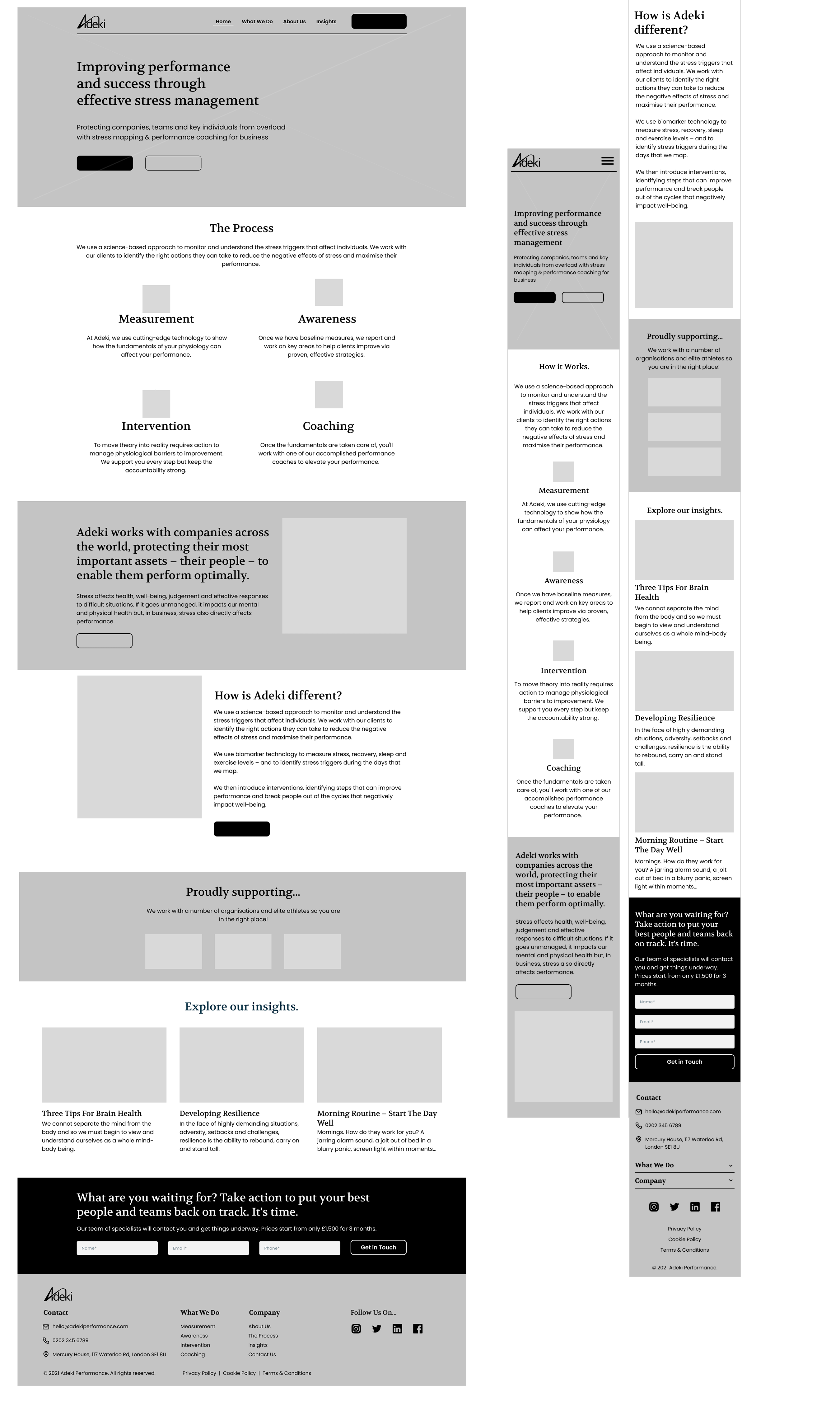
Using  Figma I created some wireframes of each page including mobile devices.

05.
PROTOTYPING

Mockups
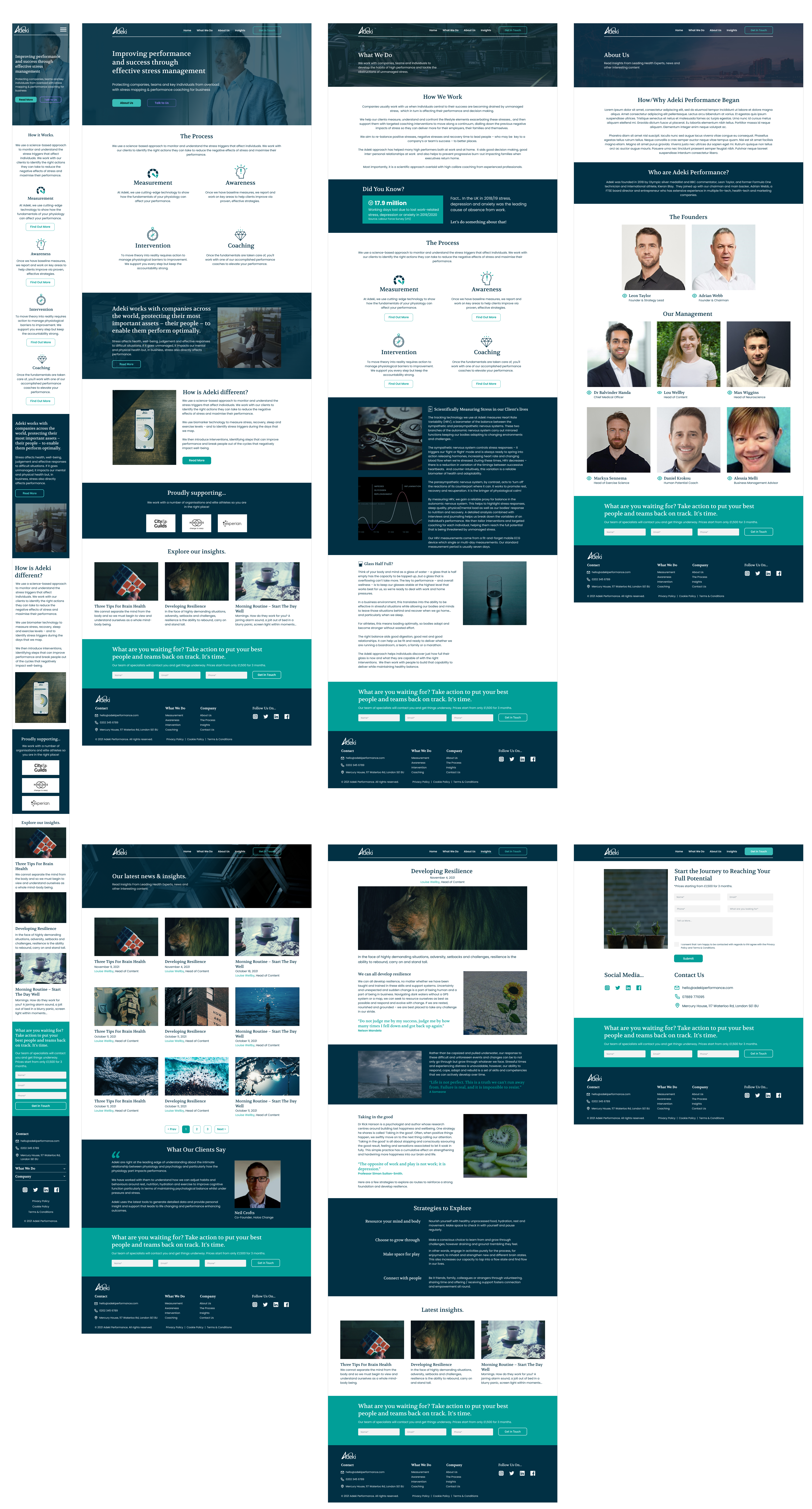
I used Figma to create high-fidelity mockups of my proposed solutions.
THE SOLUTION
A more branded, visual concept
1. Making it more visual
Using a colour palette based around the brand is important as often the website will be viewed following a meeting with Adeki Performance. 
In addition, more relevant images weere used to give a more corporate look whilst leaning towards some technology as well.
2. More Signposting & CTAs
By adding more CTAs (Call to Actions) throughout the website reduces the need for users to scroll up and down to the header or footer. Signposting was used within the content with buttons and internal links to imprve navigation.

06.
VALIDATION

Testing the Prototype
I tested the interactive prototype with 3 of the main stakeholders new users to validate whether the problem has been solved. 
Overall feedback was very positivebut I would much preferred to have insights from the previous website and the new one so I could see some real data and insights to back up the final solution.
After conducting validation tests and iterating designs:
• All users navigated through the mobile website with ease and could find what they were looking for more easily
• All users found the buttons and key information with the new accent colour much more intuitive and easier to see than the previous website
• All users felt that they would be more likely to buy or sell a holiday with the new interface

07.
KEY TAKEAWAYS

The Results...
A Better Experience
Users felt the website gave a better impression 
of Adeki and an improved experience.
A  More Confident Team
Members of Adeki Performace felt 
much happy with the new website solution
Lessons Learned
The main challenge with this project was a lack of insights. With no Analytics and no budget for user research it was much more difficult to establish pain points. I am not a fan of 'guess' work and much prefer to have some data or information to build a strong hypothesis.
What’s Next?
Due to the nature of the project, there is no plan for updates to the website at present.
However, once the app is up and running I would setup a designated page that can provide useful information and insights to help both educate and promote it.

Location

Harrogate, North Yorkshire
apartmentenvelopeusersphonepushpinsmileclock linkedin facebook pinterest youtube rss twitter instagram facebook-blank rss-blank linkedin-blank pinterest youtube twitter instagram