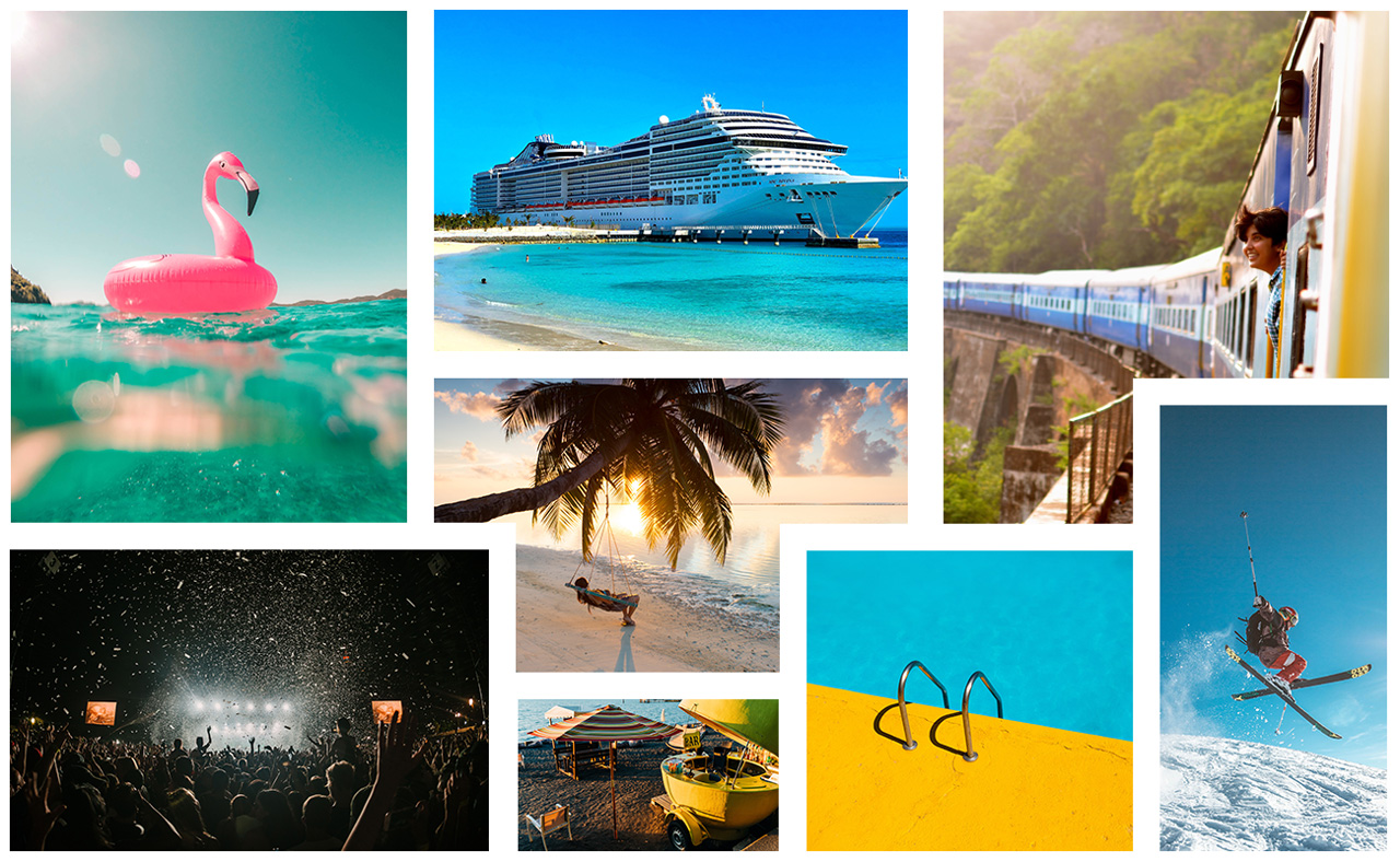
Moodboard
I created a mood board to inspire the look and feel of the user interface.
A Logo Update (of colour)
Using Adobe Illustrator I updated the logo colour to a brighter and more vibrant blue and removed the gradient to give it a fresher, cleaner look.

Updated Logo Colour
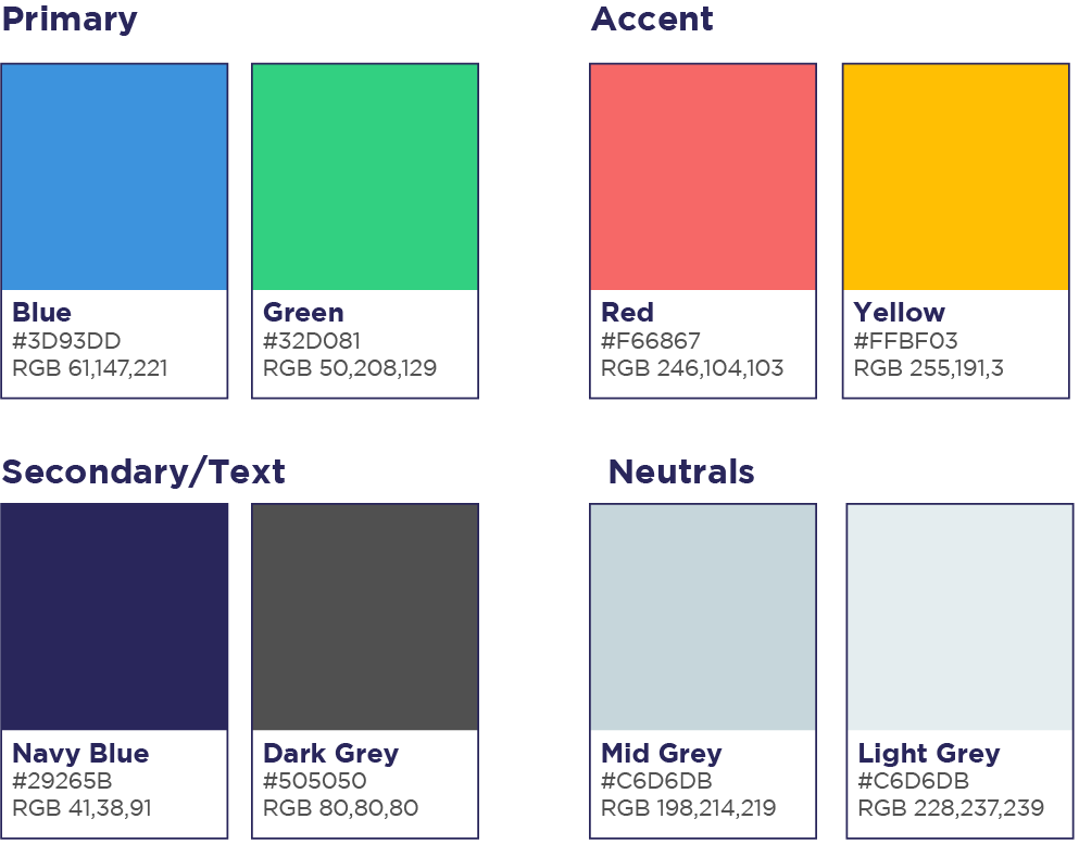
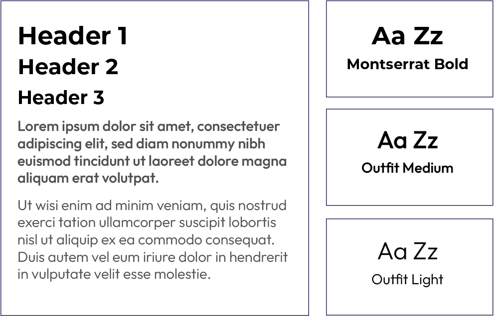
Style Guide
Travel Trader’s brand must convey fun, passion, friendliness and trust. These brand values helped inspire the colour palette, shapes, movement, and typography. I created the style guide using Figma.
Fonts
Icons
New icons were created to improve the user experience and to give the website a cleaner and simpler look.
Listing Types

UI Icons